In the complex ecosystem of software architecture, communication is the backbone of successful delivery. When multiple systems, services, or microservices interact, the flow of data and control can become opaque. This is where UML sequence diagrams become indispensable. They provide a clear, chronological view of how objects or components interact over time.
For full-stack developers, understanding these diagrams is not just about documentation; it is about clarity. It bridges the gap between backend logic and frontend expectations. This guide walks through the structure, notation, and practical application of sequence diagrams without relying on specific tools or proprietary software.
Why Sequence Diagrams Matter in Full-Stack Development 🧠
Before diving into syntax, it is crucial to understand the value proposition. A sequence diagram is a time-based interaction diagram. It answers specific questions that text descriptions often fail to address clearly:
- What happens first? Establishes the entry point of the flow.
- Who is involved? Identifies actors, clients, servers, and databases.
- How do components talk? Defines the type of message passing (synchronous, asynchronous).
- Where does logic split? Shows conditional paths and loops.
Without this visual aid, developers often rely on verbal explanations or scattered code comments. This leads to integration errors and misaligned expectations during the development lifecycle.
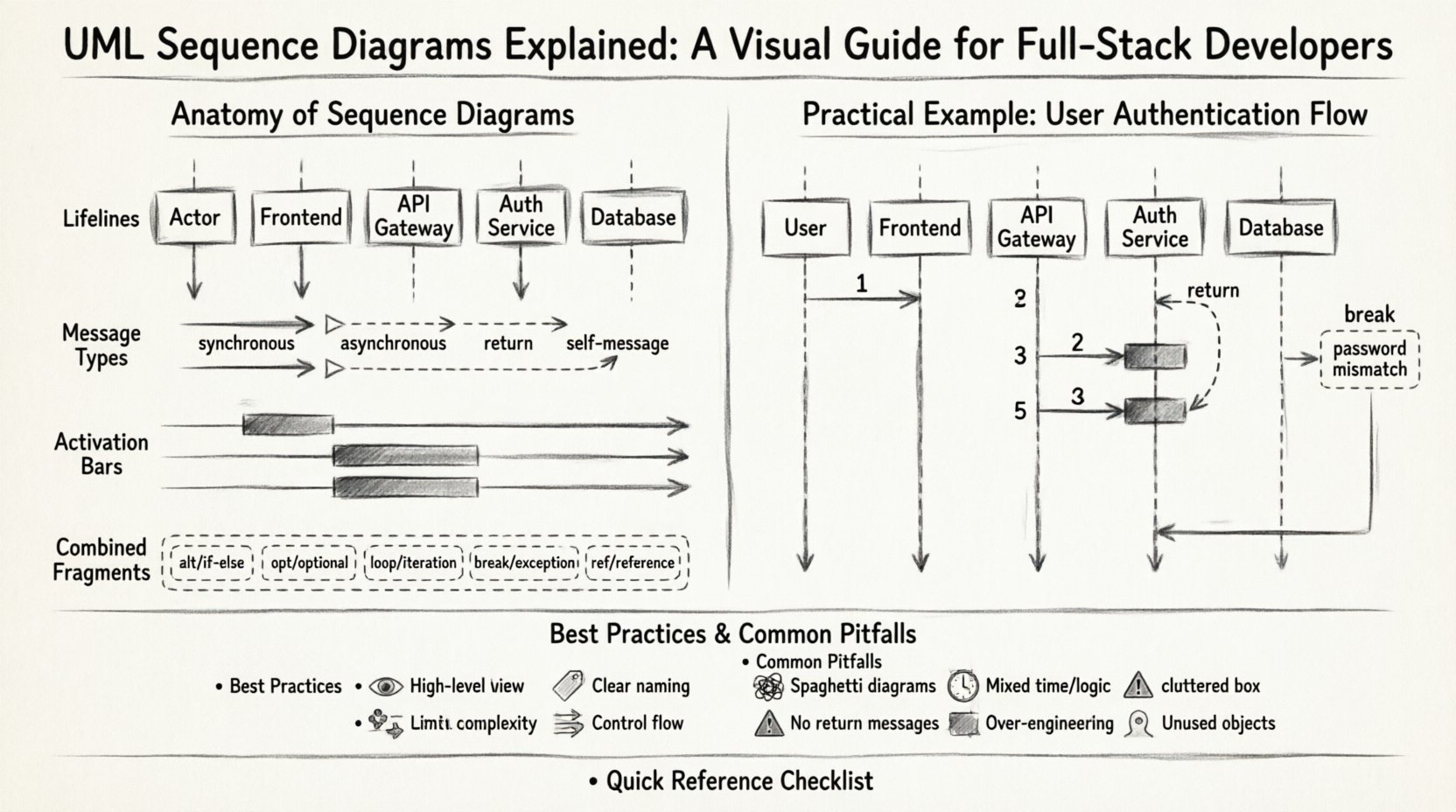
The Anatomy of a Sequence Diagram 🏗️
A sequence diagram consists of specific elements that represent the actors and the flow of information. Understanding these building blocks is the foundation of creating accurate diagrams.
1. Lifelines (Participants) 🟦
A lifeline represents an individual participant in the interaction. It is drawn as a vertical dashed line extending from the top of the diagram to the bottom. The top of the line usually contains a box or label identifying the participant.
- Actors: Human users or external systems initiating the process.
- Objects: Specific instances of classes or services within the application.
- Boundaries: Interfaces where the system meets the outside world.
- Control Objects: Logic controllers managing the flow.
2. Messages 💬
Messages represent the communication between lifelines. They are horizontal arrows drawn between the lifelines. The direction of the arrow indicates the sender and receiver.
- Synchronous Message: A solid line with a filled arrowhead. The sender waits for a response before continuing.
- Asynchronous Message: A solid line with an open arrowhead. The sender continues immediately without waiting.
- Return Message: A dashed line with an open arrowhead. This indicates a response returning to the caller.
- Self-Message: An arrow that starts and ends on the same lifeline, indicating internal processing.
3. Activation Bars ⏱️
An activation bar (or focus of control) is a thin rectangle drawn on top of a lifeline. It indicates the period during which the object is actively performing an action or waiting for a response. The top of the bar marks the start of activity, and the bottom marks the end.
4. Combined Fragments 🧩
Combined fragments allow for more complex logic, such as loops, alternatives, and optional sections. They are enclosed in a dashed frame with a specific operator in the top-left corner.
| Operator | Symbol | Function |
|---|---|---|
| alt | alt | Alternative (if/else logic) |
| opt | opt | Optional (if present) |
| loop | loop | Iterative process |
| break | break | Abort flow (exception handling) |
| ref | ref | Reference to another diagram |
Constructing a Sequence Diagram: Step-by-Step 📝
Creating a diagram requires a systematic approach. Rushing into drawing without a defined scope often results in confusion. Follow this structured process to ensure clarity.
Step 1: Define the Scenario 🎬
Start with a specific use case. Do not attempt to diagram the entire system at once. Focus on a single user journey or a specific API endpoint. For example, “User attempts to log in” or “System processes a payment request.”
Step 2: Identify Participants 🧑💼
List every entity involved in the scenario. This includes the user, the web server, the API gateway, the database, and any third-party services. Keep the list concise to maintain readability.
Step 3: Order the Interactions ⏳
Arrange the messages chronologically from top to bottom. Ensure that the sender is positioned to the left or above the receiver in a logical flow. Time flows downwards.
Step 4: Add Logic and Control 🔄
Insert combined fragments where necessary. If a request fails, add a break fragment. If a loop is involved (e.g., fetching a list of items), use a loop fragment.
Step 5: Validate and Refine ✅
Review the diagram with peers. Does the flow match the code? Are all return messages accounted for? Is the diagram readable without explanation?
Deep Dive: Interaction Types and Patterns 🔍
Different scenarios require different interaction patterns. Understanding these nuances helps in designing robust systems.
Synchronous vs. Asynchronous Communication
The choice between synchronous and asynchronous messaging impacts system performance and architecture.
- Synchronous: Best for requests requiring immediate feedback. The client blocks until the server responds. Common in user-facing actions like form submissions.
- Asynchronous: Best for background tasks. The client sends a request and moves on. Common in logging, notifications, or bulk data processing.
Object Creation and Destruction
While standard diagrams focus on messages, objects are created and destroyed during the flow.
- Creation: Represented by a message labeled with the keyword
create. - Destruction: Represented by a cross mark (X) on the lifeline where the object ceases to exist.
Recursion and Self-Interaction
Objects often process data internally. A self-message is drawn as a curved arrow starting and ending on the same lifeline. This is useful for showing internal state changes or recursive calls.
Practical Example: User Authentication Flow 🔐
To illustrate these concepts, consider a standard authentication scenario. This example demonstrates how to map a real-world process into a sequence diagram.
Scenario: User Login
A user enters credentials on a frontend interface. The system validates these credentials against a database and returns a token.
- User initiates login request to the Frontend.
- Frontend sends credentials to the API Gateway.
- API Gateway forwards the request to the Auth Service.
- Auth Service queries the Database for user records.
- Database returns user hash to Auth Service.
- Auth Service validates the password.
- If valid, Auth Service generates a token.
- Auth Service returns token to API Gateway.
- API Gateway returns response to Frontend.
- Frontend stores token and redirects user.
In the diagram, the Auth Service would have an activation bar spanning from the database query to the token generation. The Database would show a return message before the Auth Service continues.
Handling Errors (Break Fragment)
What happens if the password is incorrect? This requires a break fragment.
- Condition:
password mismatch - Action: Send error code to Frontend.
- Result: User remains on login screen.
Best Practices for Maintainable Diagrams 🛠️
Creating a diagram is one thing; keeping it useful over time is another. Software evolves, and diagrams must evolve with it. Here are strategies to maintain high-quality documentation.
1. Keep It High-Level
Avoid including every single method call. Focus on the high-level flow between major components. If a specific service calls a database, show the service and the database, not the internal SQL queries unless relevant to the architecture.
2. Use Clear Naming Conventions
Lifelines and messages should use descriptive names. Instead of obj1 or call1, use PaymentService or validateCard. This makes the diagram self-explanatory.
3. Limit Complexity
If a single diagram becomes too crowded, split it into multiple diagrams. Use the ref (reference) fragment to link complex sub-processes to separate diagrams.
4. Version Control
Treat diagrams as code. Store them in the same repository as the source code. This ensures that documentation updates are tracked alongside code changes.
5. Focus on Control Flow
Sequence diagrams are primarily for control flow, not data flow. Do not draw every byte transferred. Highlight the decisions and the triggers that drive the system.
Common Pitfalls to Avoid ⚠️
Even experienced developers make mistakes when drafting these diagrams. Awareness of common errors can save time during reviews.
| Pitfall | Impact | Correction |
|---|---|---|
| Spaghetti Diagrams | Lines cross chaotically, making flow unreadable. | Reorder participants to minimize line crossings. |
| Mixing Time and Logic | Confusion between time-based order and logical conditions. | Keep time vertical. Use frames for logic. |
| Missing Return Messages | Implies the sender hangs indefinitely. | Ensure every request has a corresponding return path. |
| Over-Engineering | Too much detail obscures the main flow. | Simplify. Focus on the happy path first. |
| Static Participants | Showing all objects at once, even if unused. | Only include participants active in the specific scenario. |
Integration into Agile and DevOps 🔄
Sequence diagrams are not just for the design phase. They play a vital role in continuous integration and delivery pipelines.
Design Phase
During sprint planning, teams use these diagrams to align on requirements. They serve as a contract between frontend and backend teams before a single line of code is written.
Code Review Phase
Developers can reference the diagram during pull requests. If the code implements a flow different from the diagram, it flags a potential misunderstanding of requirements.
Onboarding New Hires
New team members often struggle to understand the system architecture. A set of well-maintained sequence diagrams provides a quick entry point to complex logic.
API Documentation
While OpenAPI specifications describe endpoints, sequence diagrams show how those endpoints interact with internal services. They complement technical documentation.
Advanced Concepts: Timing and Constraints ⏲️
Beyond basic messages, advanced diagrams can include timing constraints and specific conditions.
Timing Constraints
Some systems require real-time responses. A timing constraint can be noted near a message or activation bar. For example, [timeout: 5s] indicates that the operation must complete within five seconds.
Guard Conditions
These are boolean expressions that determine if a message is sent. They appear in square brackets on the message arrow. For example, [user is admin] ensures that only administrators trigger specific actions.
Maintenance and Evolution 📈
Software is dynamic. Requirements change, and features are added. A static diagram becomes obsolete quickly. To keep diagrams relevant:
- Update on Change: Whenever a significant architectural change occurs, update the diagram.
- Remove Dead Code: If a service is deprecated, remove it from the diagram to avoid confusion.
- Review Cycles: Schedule regular reviews of documentation alongside code reviews.
Conclusion: A Tool for Clarity, Not Complexity 🚀
UML sequence diagrams are more than just technical drawings; they are a language for thinking about systems. They force developers to consider the order of operations, the dependencies between components, and the potential failure points.
For full-stack developers, mastering the ability to read and create these diagrams is a critical skill. It enhances collaboration, reduces bugs, and clarifies system design. By following best practices and avoiding common pitfalls, teams can maintain a living documentation set that supports long-term development goals.
Remember, the goal is not perfection in the drawing, but clarity in the understanding. Start small, focus on the critical paths, and let the diagrams evolve as the software grows.
Quick Reference Checklist 📋
- Start with a specific use case.
- Identify all participants clearly.
- Use arrows to denote message direction.
- Mark activation bars for active periods.
- Use frames for logic (alt, loop, break).
- Review for readability and accuracy.
- Update with code changes.
By integrating these diagrams into your workflow, you build a foundation for scalable, maintainable, and well-documented software systems.