Strategic planning often begins with a simple framework. You gather your team, identify internal capabilities and external pressures, and categorize them into four quadrants. The result is a SWOT analysis. Yet, too often, this document ends up in a digital drawer, viewed once during the meeting and never referenced again.
Why does this happen? The gap between data collection and actionable insight is where most projects fail. Stakeholders are inundated with information daily. A text-heavy list of bullet points rarely cuts through the noise. To create a tool that drives decisions, you must treat the SWOT diagram as a visual communication device, not just a data repository.
This guide outlines how to construct a SWOT diagram that commands attention. We will explore the psychology of strategic reading, design principles that enhance clarity, and the specific steps to ensure your analysis translates into action. No fluff, just the mechanics of effective strategic visualization.
🧩 Understanding the Framework: More Than Just Four Boxes
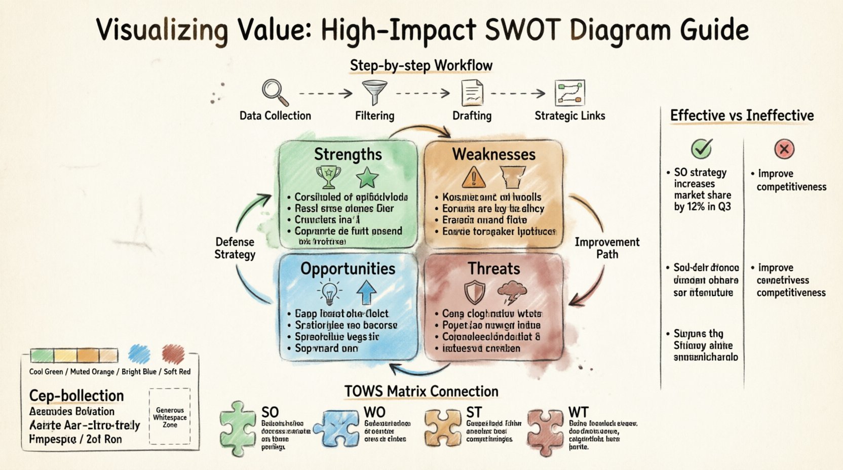
Before we discuss the visual layout, we must agree on the substance. A SWOT diagram stands for Strengths, Weaknesses, Opportunities, and Threats. It is a grid that separates internal factors (Strengths and Weaknesses) from external factors (Opportunities and Threats).
- Strengths: Internal attributes that give you an advantage over competitors.
- Weaknesses: Internal limitations that place you at a disadvantage.
- Opportunities: External chances to improve performance or gain advantage.
- Threats: External elements that could cause trouble for business or project.
However, the traditional 2×2 grid is often too static. It implies a snapshot in time, whereas strategy is dynamic. To make the diagram impactful, you must acknowledge that these categories interact. A strength can mitigate a threat. An opportunity can exploit a weakness. Your diagram needs to reflect these connections without becoming cluttered.
👀 The Psychology of the Stakeholder Reader
When you present a strategic document, you are not just informing; you are competing for attention. Stakeholders operate under cognitive load. They scan for patterns, risks, and opportunities. If they cannot find the critical information within the first few seconds, they disengage.
To counter this, consider the following psychological triggers:
- Pattern Recognition: Humans are wired to spot patterns. A clear grid structure helps the brain categorize information quickly.
- Cognitive Ease: Complex fonts or dense paragraphs increase cognitive load. Simple typography and whitespace reduce friction.
- Relevance: Stakeholders care about impact, not just inventory. They want to know what matters for the bottom line.
Most SWOT diagrams fail because they prioritize completeness over relevance. They list every possible factor, regardless of significance. A high-impact diagram prioritizes the top 3-5 factors per quadrant. Less is more.
🎨 Design Principles for Visual Clarity
Visual hierarchy dictates what the eye sees first. Without intentional design, the diagram looks like a wall of text. Use these principles to structure your content.
1. Color Coding with Purpose
Color should indicate status or category, not just decoration. A common convention involves warm and cool tones to distinguish between internal and external, or positive and negative.
- Strengths & Opportunities: Often associated with growth and positivity. Use cooler greens or blues to signal stability or forward momentum.
- Weaknesses & Threats: Associated with risk or gaps. Use muted reds or oranges to signal caution without inducing panic.
Ensure sufficient contrast between text and background. Accessibility is not optional; stakeholders may have varying levels of visual acuity.
2. Typography and Hierarchy
Headings must clearly define the quadrants. Sub-points should be indented or bulleted to separate ideas from categories. Avoid bolding entire paragraphs; instead, bold key terms within the sentences. This allows scanning.
3. Whitespace as a Tool
Whitespace is the space between elements. In a SWOT diagram, generous padding around the quadrants prevents the content from feeling cramped. It gives the eye a place to rest between sections.
📝 Step-by-Step: Creating the Diagram
Follow this workflow to build a diagram that holds up to scrutiny. This process moves from data gathering to visual synthesis.
Step 1: Data Collection
Gather input from cross-functional teams. Do not rely solely on leadership assumptions. Use surveys, interviews, or brainstorming sessions. The goal is to capture diverse perspectives before filtering.
- Internal Audit: Review financial reports, employee feedback, and operational metrics.
- External Scan: Analyze market trends, competitor moves, and regulatory changes.
Step 2: Filtering and Prioritization
Collecting data is easy; curating it is hard. Apply the following filters to your list:
- Impact: How much does this factor affect the organization?
- Probability: How likely is this factor to materialize or persist?
- Controllability: Can we influence this factor directly?
Discard items that score low on impact. If a weakness is minor and easily fixed, it may not belong in the high-level strategic diagram.
Step 3: Drafting the Grid
Arrange the prioritized items into the four quadrants. Ensure symmetry. If the Strengths section has six points, the Weaknesses section should ideally not have twenty. Balance the visual weight.
Step 4: Adding Strategic Links
A static grid is passive. Add arrows or connectors to show relationships. For example, draw a line from a Strength to a Threat to show how the strength defends against the threat. This transforms the diagram from a list into a map.
⚖️ Quality Control: Effective vs. Ineffective Points
The quality of the text within the diagram determines its utility. Vague statements lead to vague actions. Specific statements lead to accountability. Use the table below to calibrate your content.
| Category | ❌ Ineffective (Vague) | ✅ Effective (Specific) |
|---|---|---|
| Strength | Good brand reputation. | 95% customer retention rate in Q3 due to loyalty program. |
| Weakness | Slow response time. | Customer support ticket resolution takes average 48 hours. |
| Opportunity | New markets to enter. | Expansion into Southeast Asian market with 20% projected growth. |
| Threat | Competitors are aggressive. | Competitor X launched a lower-cost alternative in January. |
Notice the difference. The effective column includes metrics, timelines, and specific context. This reduces ambiguity and allows stakeholders to assess the situation accurately.
🔗 From Analysis to Action: The TOWS Connection
A SWOT diagram is a diagnostic tool. It tells you what is happening, not what to do next. To maximize value, connect your SWOT to the TOWS matrix. This involves cross-referencing the quadrants to generate strategies.
- SO Strategies: Use strengths to maximize opportunities.
- WO Strategies: Use opportunities to overcome weaknesses.
- ST Strategies: Use strengths to minimize threats.
- WT Strategies: Minimize weaknesses to avoid threats.
While the TOWS matrix is a separate document, referencing it in your SWOT presentation bridges the gap between analysis and execution. Mentioning these connections in your diagram annotations signals that you have thought beyond the surface level.
🚫 Common Mistakes to Avoid
Even with good intentions, errors creep in. Review your draft against these common pitfalls.
- Mixing Internal and External: Ensure a competitor’s move (external) is not listed under Strengths (internal). This confusion leads to misplaced resources.
- Overcrowding: Trying to fit every insight into one quadrant makes the diagram unreadable. If a point is critical, give it its own section or summary slide.
- Ignoring Context: A SWOT without a timeline is less useful. Note the timeframe for the analysis (e.g., “Fiscal Year 2024 Outlook”).
- Lack of Ownership: Stakeholders need to know who is responsible for addressing each point. Consider adding initials or department names next to key items.
📢 Presenting the Diagram
Creating the diagram is only half the work. How you present it determines whether it influences decisions.
1. The Narrative Arc
Do not simply read the points off the slide. Structure your presentation around a story:
- Context: Where are we now?
- Analysis: What does the SWOT tell us?
- Implication: What does this mean for our goals?
- Action: What are we doing next?
2. Interactive Review
If possible, allow stakeholders to interact with the diagram. Ask them to vote on the most critical threats or opportunities. This engagement increases buy-in. When people contribute to the analysis, they feel ownership of the resulting strategy.
3. Distribution
Share the diagram in a format that is accessible. PDFs are good for archiving, but interactive formats allow for filtering and deeper dives. Ensure the file size is manageable for email distribution.
🔄 Measuring the Impact
How do you know if your SWOT diagram was effective? Look for behavioral changes, not just approval.
- Reference Rate: Is the diagram mentioned in subsequent meetings?
- Decision Alignment: Do resource allocation decisions reflect the priorities identified in the SWOT?
- Stakeholder Feedback: Ask participants what they found most useful about the visual.
If stakeholders ask for updates in three months, the diagram has value. If it is never mentioned again, the content or presentation needs adjustment.
🛠️ Technical Considerations for Layout
When building the diagram, consider the medium. Will it be printed on a large poster, displayed on a projector, or viewed on a mobile device?
Printed Materials
Ensure font sizes are legible at 100% zoom. High contrast is essential for black-and-white printing. Avoid relying solely on color to convey meaning.
Digital Displays
Use vector graphics to ensure sharpness on high-resolution screens. Animations can be used to reveal quadrants one by one, but keep them subtle. Flashing or moving elements distract from the content.
Mobile Viewing
If stakeholders access the document on phones, the 2×2 grid may be too wide. Consider a stacked layout for mobile versions where quadrants appear vertically.
🤝 Collaboration and Review
A SWOT analysis is rarely the work of one person. It requires collaboration. Use a shared workspace to gather input before finalizing the visual. This prevents the “surprise factor” during the presentation.
- Draft Phase: Share the raw list for comments.
- Design Phase: Create the visual layout.
- Review Phase: Check for accuracy and tone with key decision-makers.
- Finalize: Lock the document and distribute.
Reviewing the diagram for tone is crucial. A SWOT that sounds overly critical of the organization can create defensiveness. Frame weaknesses as areas for development rather than failures. Frame threats as challenges to be met rather than inevitable disasters.
📈 Long-Term Strategy Integration
SWOT analysis should not be a one-off event. Integrate it into your annual planning cycle. Compare the current diagram with the previous year’s to track progress on weaknesses and the emergence of new threats.
Use the diagram as a baseline for KPIs. If a weakness is “High employee turnover,” the KPI should be “Reduce turnover by 10%.” If a strength is “Strong cash flow,” the KPI might be “Allocate 20% to R&D.” The diagram informs the metrics.
🧭 Final Thoughts on Strategic Visualization
Creating a high-impact SWOT diagram is about respect for the audience’s time and cognitive capacity. It requires discipline to cut out the noise and focus on the signal. It demands a design that guides the eye and text that guides the mind.
When stakeholders can look at your diagram and immediately understand the strategic landscape, you have succeeded. You have moved from generating data to generating insight. This shift is what separates routine administrative tasks from genuine strategic leadership.
Focus on clarity, prioritize relevance, and ensure the visual design supports the message. With these elements in place, your SWOT diagram becomes a living tool for decision-making, rather than a static artifact of planning.