


In the landscape of software architecture and system design, clarity is currency. Among the various tools available to visualize interactions, the UML Sequence Diagram stands out as a primary instrument for mapping time-based behavior. However, a persistent layer of confusion surrounds how these diagrams should be constructed and interpreted. Many teams approach them with incorrect assumptions, leading to documentation that is either useless or misleading.
This guide addresses the specific friction points encountered during the modeling process. We will dissect five common misconceptions that hinder effective communication between stakeholders. By understanding the reality behind these myths, you can ensure your diagrams serve their true purpose: defining clear interaction contracts.
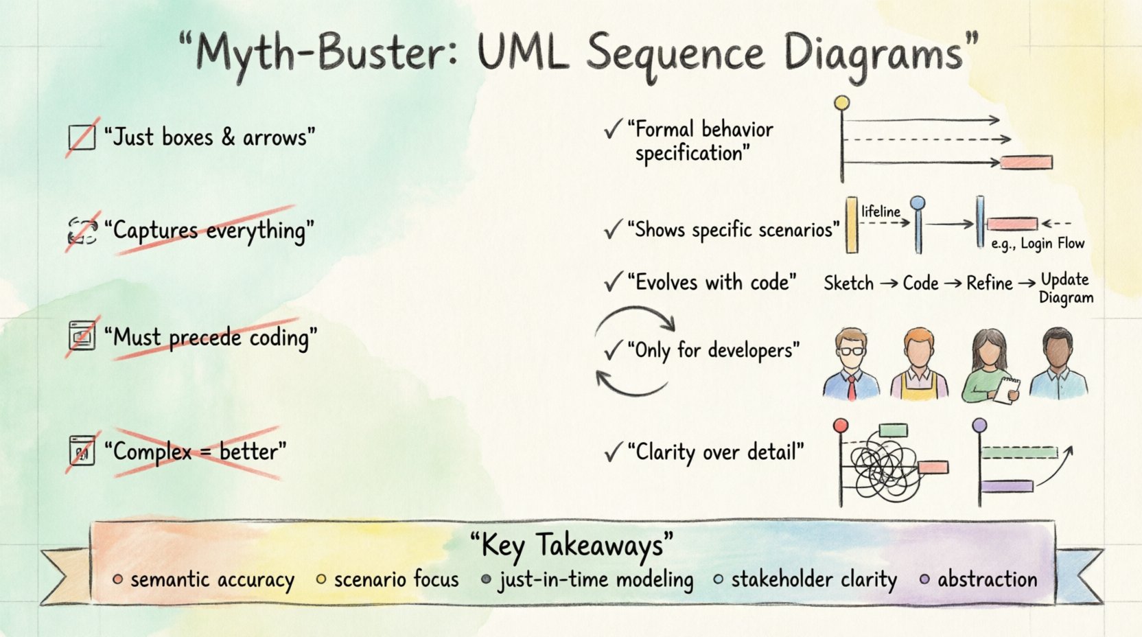
1. Myth: It Is Just About Drawing Boxes and Arrows 📐
The most prevalent misunderstanding is that a sequence diagram is primarily a visual exercise. Many practitioners believe that if the lines are straight and the boxes are aligned, the diagram is “correct.” This focus on aesthetics over semantics is a critical error.
The Reality of Semantics
A sequence diagram is a formal specification of behavior, not a sketch. Every element carries specific meaning defined by the standard.
- Objects: These represent instances of classes or components. They are not merely shapes; they represent active participants in a specific scenario.
- Messages: Arrows denote the passing of data or signals. A solid arrow typically indicates a synchronous call, while a dashed line indicates a return message.
- Activation Bars: The rectangles on the lifelines indicate the period during which an object is performing an action. This is crucial for understanding concurrency and blocking calls.
If you focus only on the look, you risk creating a diagram that is visually pleasing but logically flawed. A developer looking at the diagram should be able to deduce the flow of control without guessing the intent. The precision of the notation determines the reliability of the documentation.
The Consequence of Aesthetic Focus
When teams prioritize style over logic, several issues arise:
- Ambiguity: Users may not know if a message is synchronous or asynchronous.
- Implementation Errors: Developers might implement a call as a fire-and-forget signal when it requires a response, leading to race conditions.
- Documentation Decay: If the diagram does not accurately reflect the code, it becomes obsolete immediately upon the first change.
Therefore, the goal is not to make the diagram look neat, but to ensure the logical flow is unambiguous. Use the standard symbols correctly. If a message is asynchronous, use the open arrowhead. If it is a return, use the dashed line. These details are not decorative; they are functional.
2. Myth: It Captures All System Behavior 🔄
There is a belief that if a sequence diagram is complete, it describes the entire system. This leads to diagrams that are incredibly dense, attempting to show every possible state, error condition, and variation in a single view.
The Limitation of Scope
Sequence diagrams are designed to show a specific scenario or use case. They are time-sliced views of interaction. They are not state machines, nor are they class diagrams. They do not show the internal structure of an object, nor do they show the lifecycle of the object across the entire application lifespan.
A single sequence diagram usually represents one “happy path” or one specific variation of a process. Attempting to cram all logic into one diagram makes it unreadable. It violates the principle of separation of concerns.
What Sequence Diagrams Do Not Show
- Internal State Transitions: They do not show when an object changes from “Open” to “Closed” internally. For that, a State Machine Diagram is required.
- Global System Constraints: They do not show security policies, database schemas, or network topology.
- Exception Handling Depth: While they can show error messages, they rarely show the full stack trace or the recovery logic for every exception type.
To understand the full system, you must combine sequence diagrams with other modeling artifacts. Relying solely on sequence diagrams to represent system logic is like trying to read a novel by only looking at the character dialogue without the narrative context.
3. Myth: It Must Be Created Before Coding 💻
In traditional waterfall methodologies, the design phase was strictly separated from the implementation phase. This created a dogma that diagrams must be completed 100% before a single line of code is written. In modern development contexts, this rigidity often slows progress without adding value.
Agile and Iterative Design
While design is vital, the diagram should evolve alongside the code. In many cases, it is impossible to know the exact interface requirements without seeing the implementation constraints.
- Just-in-Time Modeling: Creating the diagram just before the implementation of a specific module ensures relevance.
- Refactoring: As the architecture changes, the diagram must change. If the code changes but the diagram remains static, the diagram is now a lie.
- Reverse Engineering: Sometimes, the code exists first. Generating a diagram from the code can help visualize complex logic that was previously undocumented.
The Risk of Over-Engineering
Insisting on a pre-coding diagram for every minor feature leads to wasted effort. If a feature is small or experimental, a high-level sketch or a simple text description is often sufficient. Saving the formal diagram for complex interactions where the flow is non-trivial is a better strategy.
Furthermore, rigid pre-planning often ignores the reality of discovery. Developers often discover edge cases during implementation that were not anticipated in the initial design. A diagram created weeks prior to coding may need to be discarded entirely if the requirements shift.
4. Myth: It Is Only for Developers 👨💻
Another common misconception is that sequence diagrams are a technical artifact meant solely for the engineering team. This limits their value significantly. If only the people writing the code understand the diagram, it fails as a communication tool.
Stakeholder Communication
Product managers, testers, and business analysts need to understand how the system behaves. A sequence diagram is often clearer than a requirements document for explaining flow.
- QA and Testing: Testers use these diagrams to derive test cases. If the diagram shows a specific sequence of calls, the tester knows exactly what to validate.
- Business Analysis: Non-technical stakeholders can often follow the flow of data better than they can read a database schema. It helps them verify that their business logic is being respected.
- Onboarding: New team members can learn the system architecture by reading the interaction flows rather than digging through thousands of lines of code.
Bridging the Gap
To make these diagrams accessible to non-technical audiences, you must focus on clarity.
- Avoid Technical Jargon: Use names that reflect business concepts where possible (e.g., “User” instead of “UIControllerInstance1”).
- Group by Function: Use frames or grouping boxes to indicate which business process is being depicted.
- Keep it Simple: Remove low-level details like variable assignments that do not affect the interaction flow.
When a diagram serves only developers, it becomes an internal reference. When it serves the whole team, it becomes a shared source of truth.
5. Myth: Complex Diagrams Are Better 🧩
There is a temptation to show everything. The belief is that if a diagram is complex and detailed, it must be comprehensive. However, complexity is the enemy of comprehension. A diagram with hundreds of lifelines and thousands of messages is impossible to read.
The Principle of Abstraction
Good design involves abstraction. You should hide irrelevant details to focus on the core interaction. If you include every API call, every database query, and every internal method, the diagram becomes a wall of text.
- Focus on the Flow: Show the high-level messages between systems. Internal processing can be summarized.
- Use Frames: Group complex logic into combined fragments (like [alt], [opt], [loop]). This allows you to show variation without drawing separate lines for every possibility.
- Break It Down: If a process is too complex for one diagram, split it into multiple diagrams. One for the “Order Placement” flow and another for the “Payment Processing” flow.
Cognitive Load
Human working memory is limited. When a viewer is presented with a diagram that has too many elements, they cannot process the information. They will skip the diagram entirely.
A simple, clear diagram that shows the critical path is far more valuable than a complex one that attempts to show everything. If the diagram is hard to read, it is not useful. Simplicity is a feature, not a limitation.
Summary of Misconceptions
To reinforce the points made above, the following table contrasts the common myths with the practical reality.
| Misconception | Reality | Key Takeaway |
|---|---|---|
| It is just drawing boxes and arrows 📐 | It is a formal specification of behavior 📝 | Focus on semantic accuracy, not aesthetics. |
| It captures all system behavior 🔄 | It shows specific scenarios ⏱️ | Combine with state diagrams and class diagrams. |
| It must be created before coding 💻 | It evolves with the code 🔄 | Use just-in-time modeling to maintain relevance. |
| It is only for developers 👨💻 | It is for the whole team 🤝 | Write for stakeholders, not just engineers. |
| Complex diagrams are better 🧩 | Clarity is better than detail 🧠 | Use abstraction and grouping to reduce noise. |
Best Practices for Effective Modeling 🛠️
Now that the myths are cleared, what should you actually do to ensure your sequence diagrams add value? Here are actionable guidelines for implementation.
1. Define the Scope Clearly
Every diagram should have a clear title and a defined context. What is the trigger? What is the expected outcome? If a diagram does not answer “What am I looking at?”, it should be rewritten. Include a brief description at the top of the diagram explaining the scenario.
2. Use Standard Notation
Do not invent your own symbols. If you use a specific arrow style, document it or stick to the standard UML 2.0 specification. Consistency allows team members to switch between diagrams without relearning the syntax.
3. Keep Lifelines Consistent
Ensure that objects appear in the same order across related diagrams. If “User” is on the far left in one diagram, it should be on the far left in the next. This spatial consistency aids in scanning and understanding relationships.
4. Highlight Critical Paths
Use bold lines or distinct colors (if your tool allows, though style is generally discouraged) to highlight the primary success path. Secondary paths should be clearly marked as alternatives. This helps readers identify the “happy path” quickly.
5. Review and Refine
Treat diagrams as living documents. When a code review happens, check if the diagram matches the code. If it does not, update the diagram. A diagram that does not match the code is worse than no diagram at all, because it actively misleads.
Impact on Maintenance and Technical Debt 📉
Incorrect modeling practices contribute directly to technical debt. When developers rely on outdated diagrams, they make decisions based on false premises. This leads to refactoring that breaks assumptions, and integration issues that are harder to debug.
- Debugging Efficiency: When a system fails, a correct sequence diagram helps trace the message flow instantly. An incorrect one sends you down the wrong path.
- Onboarding Time: New hires spend less time understanding the system if the diagrams are accurate and clear.
- Refactoring Safety: When modifying code, the diagram serves as a contract. If the diagram shows a dependency, you know to test that interaction carefully.
Investing time in accurate modeling pays dividends in reduced maintenance costs over the lifecycle of the software. It is not an upfront cost; it is an investment in long-term stability.
Final Thoughts on Interaction Modeling 🎯
Understanding the nuances of UML Sequence Diagrams is essential for any team aiming for high-quality software architecture. By discarding the myths, you shift from creating decorative artifacts to building functional specifications.
Remember that the tool is a means to an end. The end is clear communication and robust design. Do not let the complexity of the notation overshadow the clarity of the message. Keep diagrams focused, accurate, and relevant to the people who need to read them.
When you apply these principles, you move beyond simple documentation. You create a shared language that aligns your team, reduces errors, and accelerates development. The sequence diagram, when used correctly, is one of the most powerful tools in your technical arsenal.
Start by auditing your current diagrams. Do they suffer from any of the misconceptions discussed? If so, take the first step toward clarity. Refine the scope, simplify the view, and ensure they reflect the reality of your system. This disciplined approach will lead to better software and a more cohesive team environment.
Clarity wins. Accuracy wins. Documentation that works wins.