


Creating clear documentation is a fundamental skill for any software engineer. Among the various modeling tools available, the UML Sequence Diagram stands out as a powerful way to visualize interactions. It shows how objects or system components communicate with each other over time. For beginners, understanding the syntax and logic behind these diagrams can seem daunting. However, with a structured approach, anyone can learn to map out complex flows effectively.
This guide provides a deep dive into the mechanics of sequence diagrams. We will explore the essential elements, the step-by-step process of creation, and the notation rules that ensure clarity. By the end, you will have the knowledge to draft professional diagrams that communicate logic without ambiguity.
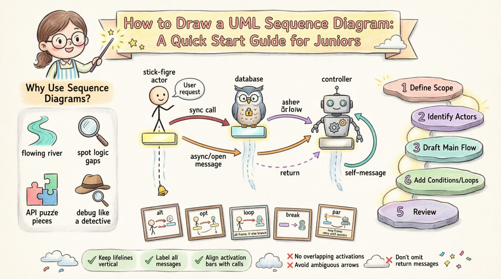
🧩 Understanding the Purpose of Sequence Diagrams
Before putting pen to paper (or mouse to screen), it is vital to understand why we create these diagrams. A sequence diagram is not just a picture; it is a specification of behavior. It captures the dynamic aspect of a system. While class diagrams show structure, sequence diagrams show action.
Here are the primary reasons to use this notation:
- Visualizing Flow: It tracks the order of events from start to finish.
- Identifying Logic Gaps: It helps spot missing error handling or unhandled states.
- API Documentation: It serves as a blueprint for how services should talk to each other.
- Debugging: It helps developers trace where a request might be failing in a chain of dependencies.
Think of a sequence diagram as a script for a play. The actors are the objects, the lines are the dialogue (messages), and the stage directions are the conditions and loops.
🛠 Core Building Blocks of the Diagram
To draw a valid diagram, you must know the standard symbols. These elements form the grammar of the language. Every element has a specific meaning regarding timing and responsibility.
1. Participants (Lifelines)
Participants represent the entities involved in the interaction. These can be:
- Human Actors: Represented by a stick figure icon.
- External Systems: Databases, third-party APIs, or legacy systems.
- Internal Objects: Classes, controllers, or services within your application.
Each participant is drawn as a vertical dashed line extending downwards. This line is called a Lifeline. It represents the existence of the object over time. If the line stops, the object no longer exists in that scope.
2. Activation Bars
When an object is actively performing a task, we draw a thin rectangle on its lifeline. This is known as an activation bar or execution occurrence. It indicates that the object is currently busy processing a message. It is crucial for showing concurrency and blocking states.
3. Messages
Messages are the arrows connecting the lifelines. They represent method calls, signals, or data transfers. The direction of the arrow determines who is calling whom. The top of the arrow aligns with the activation bar of the sender, and the bottom aligns with the activation bar of the receiver.
📝 Step-by-Step Creation Process
Creating a diagram requires a logical workflow. Do not start drawing immediately. Plan first to ensure the diagram remains readable.
Step 1: Define the Scope
Decide what specific interaction you are documenting. A single diagram should usually cover one specific use case or scenario. Trying to cram an entire system login, checkout, and logout into one diagram will result in chaos. Break complex flows into smaller, manageable sequences.
Step 2: Identify the Actors
List the participants involved. Who initiates the action? Usually, a user or an external trigger starts the process. Place the initiator on the far left. Place the internal objects to the right. This left-to-right arrangement helps readers follow the flow naturally.
Step 3: Draft the Main Flow
Draw the primary happy path first. This is the scenario where everything works as intended. Use solid arrows for synchronous calls. Ensure the order of messages reflects the actual execution time. Time flows from top to bottom.
Step 4: Add Conditions and Loops
Once the main path is clear, add the exceptions. Where might the system branch off? Use frames for alternative paths (if-else statements) or loops (for-each iterations). This adds realism to the diagram.
Step 5: Review and Refine
Check for consistency. Do all arrows have return paths? Are the names descriptive? Remove any redundant lines. A clean diagram is better than a complete but messy one.
📏 Message Types and Notation
Not all arrows are created equal. Using the correct arrow style conveys specific technical details about how the communication happens. Below is a reference table for common message types.
| Message Type | Arrow Style | Behavior |
|---|---|---|
| Synchronous Call | Solid line, filled arrowhead | The sender waits for the receiver to finish before continuing. Common in function calls. |
| Asynchronous Signal | Solid line, open arrowhead | The sender sends the message and continues immediately without waiting. Common in event triggers. |
| Return Message | Dashed line, open arrowhead | The receiver sends data back to the sender. Often implied but explicit return arrows add clarity. |
| Self-Message | Curved arrow starting and ending on the same lifeline | The object calls one of its own methods. |
When drawing these, ensure the label on the arrow describes the action clearly. Use verbs. For example, instead of “data”, write “fetchUserData”. This makes the diagram self-explanatory.
🔄 Advanced Interactions (Combined Fragments)
Real-world logic is rarely linear. We often need to represent choices, repetitions, or parallel processing. UML provides Combined Fragments to handle these scenarios. These are represented by a rectangular frame surrounding the relevant messages.
Alt (Alternative)
The alt fragment represents an if-else structure. It divides the diagram into sections separated by dashed lines. Each section has a condition. The system executes only the section where the condition evaluates to true. This is essential for error handling paths.
Opt (Optional)
The opt fragment is similar to alt but implies that the block is optional. If the condition is false, the entire block is skipped. It is often used for non-critical features.
Loop
Use the loop frame when an action repeats. It indicates that the enclosed messages occur multiple times. You can specify a condition like “for each item in list” above the frame.
Break
The break frame is used to indicate an exception or an early exit from a loop or sequence. It shows a path where the normal flow is interrupted.
Par (Parallel)
The par frame indicates that multiple lifelines are processing messages simultaneously. This is useful for showing concurrent threads or background tasks running alongside the main request.
💡 Best Practices for Clarity
Technical accuracy is only half the battle. Readability is the other half. A diagram that is technically correct but impossible to read fails its purpose. Follow these guidelines to maintain high quality.
- Keep Names Descriptive: Avoid generic names like
obj1orcall1. Use domain language. If you are modeling a banking app, useAccountinstead ofBankObject. - Limit Complexity: If a diagram has more than 10 lifelines, it is likely too complex. Split it into sub-diagrams or abstract the lower-level interactions.
- Use Consistent Orientation: Always keep the time axis vertical. Do not rotate the diagram.
- Group Related Messages: If multiple messages happen in a tight sequence, ensure the spacing is uniform.
- Add Comments: Use sticky notes or text boxes to explain complex logic that cannot be captured by arrows alone.
- Standardize Arrowheads: Ensure filled arrows are used for calls and open arrows for returns across the entire document.
🚫 Common Mistakes to Avoid
Even experienced designers make errors. Being aware of common pitfalls can save you time during reviews.
- Mixing Levels of Abstraction: Do not show a database query inside the same diagram as the user interface click. Keep high-level flows separate from low-level implementation details.
- Missing Return Paths: While sometimes implied, showing return messages helps clarify data flow, especially when complex objects are returned.
- Creating Dead Ends: Every activation bar should ideally connect to a return or a subsequent message. Orphaned bars suggest unfinished logic.
- Overloading Frames: Do not nest too many frames inside one another. Deep nesting makes the diagram hard to follow. Try to flatten the structure where possible.
- Ignoring Time: Ensure the vertical position of messages makes sense. A return message cannot appear before the call message that generated it.
📂 Documenting the Lifecycle
One of the most powerful uses of a sequence diagram is documenting the lifecycle of a resource. Consider an object that is created, used, and destroyed. You can visualize this clearly.
1. Creation: The diagram often starts with a message that creates the object. The lifeline begins at that point.
2. Usage: The object receives messages while active.
3. Destruction: If the object is temporary, you can mark the end of its lifeline with an X. This symbol indicates that the object is no longer valid or accessible after this point.
This visual cue helps developers understand memory management and scope. It prevents the assumption that an object persists indefinitely when it should be garbage collected or closed.
🔍 Validation and Verification
Once you have drawn the diagram, you must validate it. This process is often called walkthroughs.
- Peer Review: Ask a colleague to trace the flow without your explanation. If they get stuck, the diagram needs clarification.
- Consistency Check: Does the sequence match the class diagram? If the sequence calls a method that does not exist in the class model, there is a conflict.
- Completeness: Have you covered the happy path and the major error paths?
Validation ensures that the documentation matches the actual code. It bridges the gap between design and implementation.
🎯 Summary of Key Concepts
To recap, drawing a sequence diagram involves the following core principles:
- Time Flows Down: The vertical axis represents time.
- Interaction is Key: Focus on the messages between objects.
- Notation Matters: Use the correct arrow types for synchronous and asynchronous calls.
- Scope Control: Keep diagrams focused on specific use cases.
- Clarity Over Detail: It is better to show the flow than every single variable assignment.
By adhering to these standards, you create artifacts that serve as valuable documentation. They become a reference point for new team members and a guide for future refactoring. Remember, the goal is communication. If the diagram helps the team understand the system better, it has succeeded.
🚧 Moving Forward
As you gain experience, you will find yourself creating more complex scenarios. You might deal with distributed systems, microservices, or event-driven architectures. The principles remain the same, but the scale increases. You may need to use multiple diagrams to describe a single transaction across different services.
Start with the basics. Master the lifelines and messages. Practice drawing simple flows until they become second nature. Then, gradually introduce fragments and conditions. With patience and practice, you will be able to visualize any system interaction with precision and confidence.